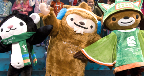
anyways, so the vancouver olympics are coming up so the olympic people here in vancouver decided it was time to show us what the mascots were going to look like, Now that you have scrolled down to see the pic before finishing reading what i have said…THESE THINGS ARE SOOOOOOO RETARDED LOOKING I will post the news link so you can read about them but in a nut shell they are native indian creatures with a japanese anime flare… sorry I had to pause there I almost passed out from the frustration that these things give me I mean sure the big fuzzy brown thing is a sasquatch but all I feel like it does for me, is give me wanting to kick it in the crotch! Im sick of this city creating a stereotype of vancouver and it being just one big native art museum…ITS NOT (There is nothing wrong with native art) why not make the mascots like a lumberjack you know something to represent where most of our money comes from or if for some reason stereotypes are more fun why not a rain drop. Now I will give credit these things are making children go crazy every kid I have talked to wants one of each and cant stop talking about them, so good for you marketing people and designers you did your job…but… THEY ARE STILL THE DUMBEST THINGS I HAVE EVER SEEN
I don’t really like them either, but really how important is an Olympic mascot? I have watched my share of Olympic games on TV and I cant remember ever seeing a mascot.
Maybe other people pay more attention to these things but I think that Canada will be judged more on our performance and venues than our mascots.
I didn’t read in your post where you described what you didn’t like about those cuddly creatures. They are not intended to attract Canadians to the Olympics, I think. Their market is the “rest of the world” and perhaps their designers have a better idea of the boiled-down tastes that market represents? I certainly am not going to say “Eww, stupid mascot; now I’m not going to go or otherwise spend any money on these Olympics!” On the contrary, Jacquie and I might actually show up. And not because of the mascots, or any lack of unicycle events.
ok I’m sorry for using “retarded” I didn’t realize everyone was so sensitive about the word . Also the Vancouver Olympic logo is what is supposed to attract the world not a ear muff wearing Sasquatch. Any way these mascots were a seriouse waste of money, you would think that with the amount of money spent we could get something a little better
one exception: Pascal Mariscal’s “Cobi” for the Barcelona games! this one was not designed to be politically correct or even “cuddly”.
why are designers not creative when dealing with mascots?
edit: I may not like “retarded” but I like the new word “retarted”!!!