yeah its kinda why i did, but it can be changed easily and if it is chosen then ill have to contact k1 i suppose
I prefer uniduncs the best because its simple yet effective!
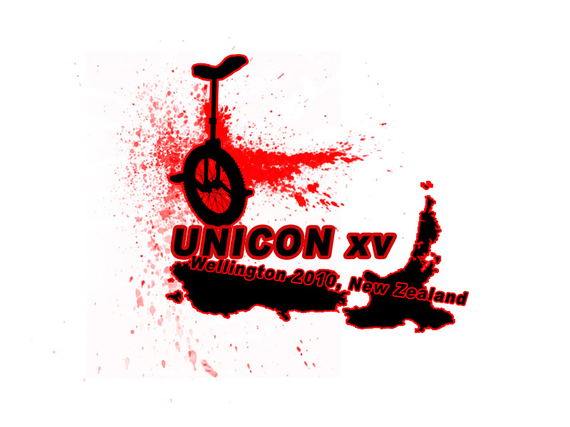
Texas Chainsaw Unicon!
You really think people are going to be thinking of the lettering stroke when they look at that?
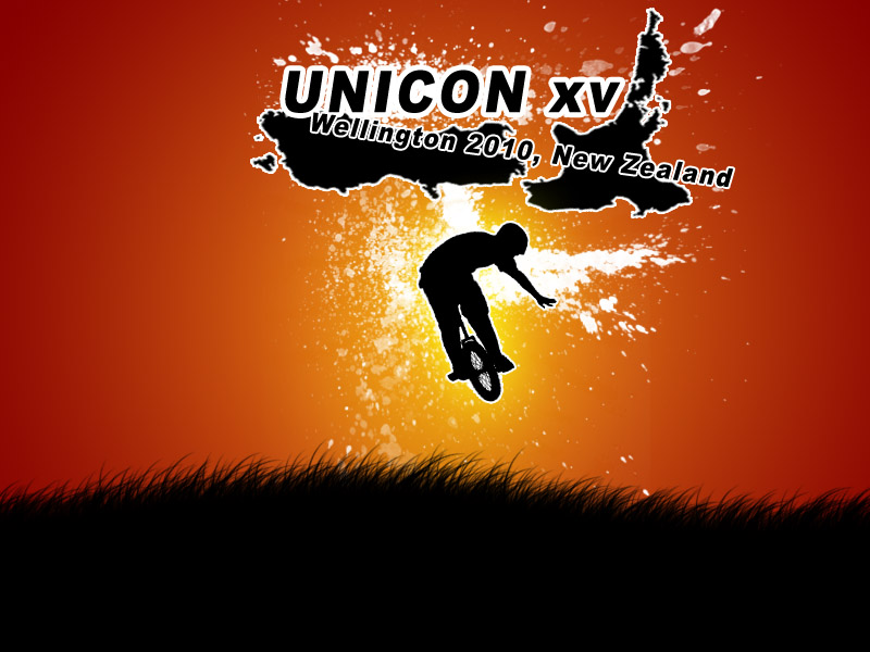
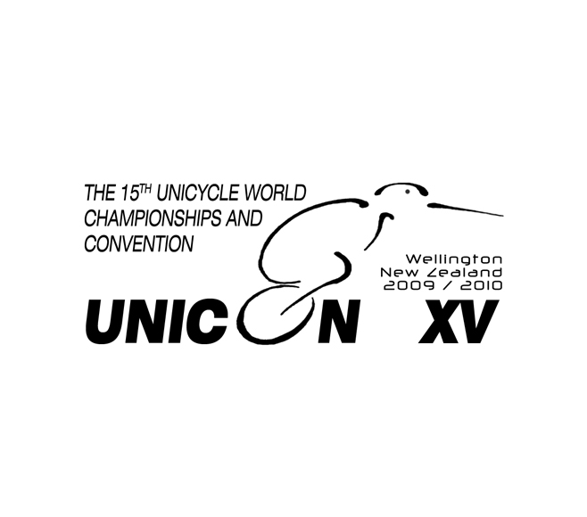
It’s a pretty cool logo, but the red bits could look a bit strange when printing it on medals etc. Also, having the NZ outline in that position is a bit abstract. Only my opinion of course, but I’d suggest putting the NZ outline in a more traditional position.
Agreed. I don’t even know what your trying to go for there…
why is everything on an angle?
There now everything isnt on an angle!!! woo like this colour more then the red also… i donno, but i think this logo is kinda pimping… any more comments?
maybe i will play with some textures later…

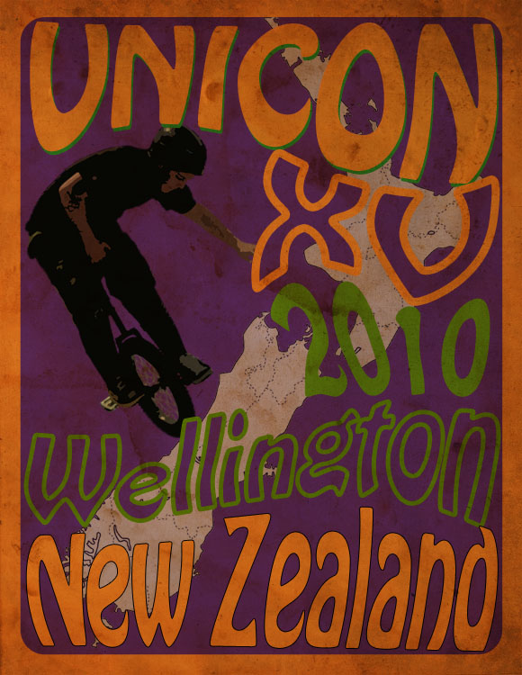
Psycadelic! I’m digging. Still goin with Kohse’s one though. Production wise, I think its better. But yours would make an AWESOME poster or shirt, I’d buy it.
Edit: I’d buy it in an instant, espescially if the rest of the shirt was that orange. Mint.
That is proper cool!
I especially love the mad kiwi bird. Reminds me of the uni cartoons, can’t remember the name of them.
+1
That looks proper cool! My favourite so far!
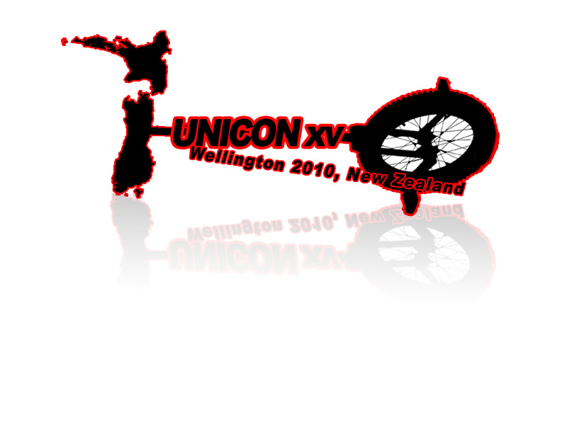
I tryed lol

this would be a cool poster, make them and sell them.
That’s my favourite. Nice and simple so it stands out. Also a kiwi on a unicycle is good idea.
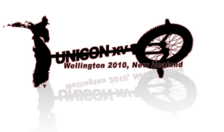
how do you guys make these?