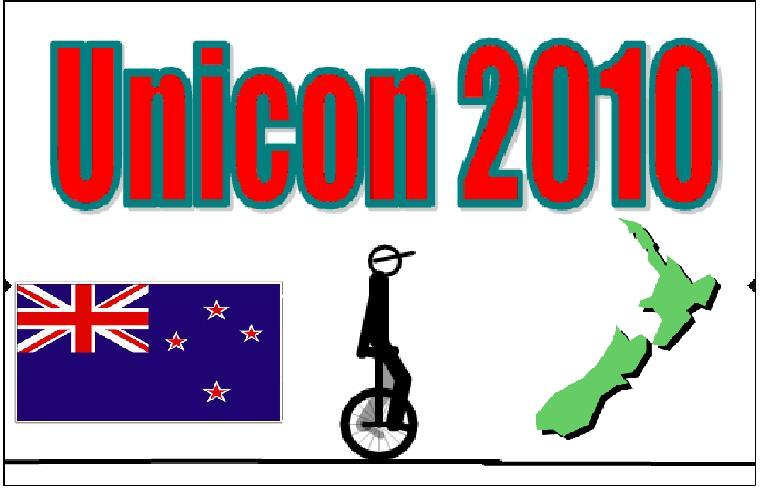
Well here’s my bad sketch. 
i dont mind the design, but i didnt like the placement of all of the information. Having it on the side is difficult to read.
Are you guys using random images you find on the web, or is there some special place to get them so you can use them legally and stuff? Or is that not a problem?
its important to get the rights to use imagery from other people.

better??
The picture of the unicycle is pretty commonly used. I’ve got 3 unicycle shirts that have that specific unicycle pic.
Would be better with a diff pic… Not nessesarily a diff unicycle. Just a diffrent pic of that unicycle. KH07 ftw!
mm i just edited a pic of a KH to look like that from the
actuall uni.
but yeahh ill see what i can find otherwise.

thanks for your opinion.
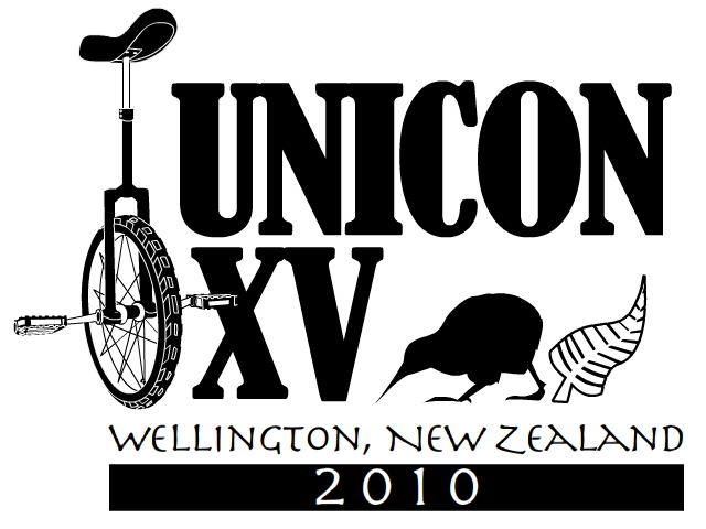
It looks like the stock KH07 display picture. Exactly the same actually, it even looks like its still go snafus on it haha…
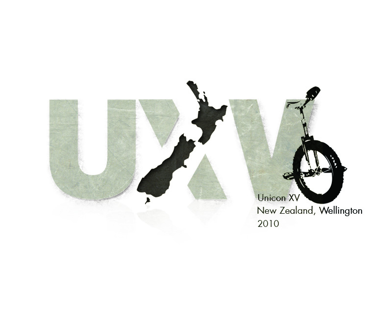
I really like the feel of this one. I would try and include “world unicycle championships” or something similar and after unicon there should be more of a gap. The only thing I dont like is, it seams to sort of be off ballance, its all to the left. Most logos are like symetricly weighted left to right and well this isnt thats all.
Some awesome logos everyone.
Just to reiterate what was mentioned…if you are taking photos off the net (eg of a Silver Fern, Kiwi, Unicycle etc), please modify it enough that it is unrecognisable from the original. Otherwise we would not be able to use it due to copyright issues. Otherwise design them from scratch.
Also, Unicon XV runs over the New Year period, so technically it is Wellington, New Zealand 2009/2010.
Cheers,
Ken
What if you asked, and recieved permission to use the photo / image?
Yep should be Ok, but have it in writing.
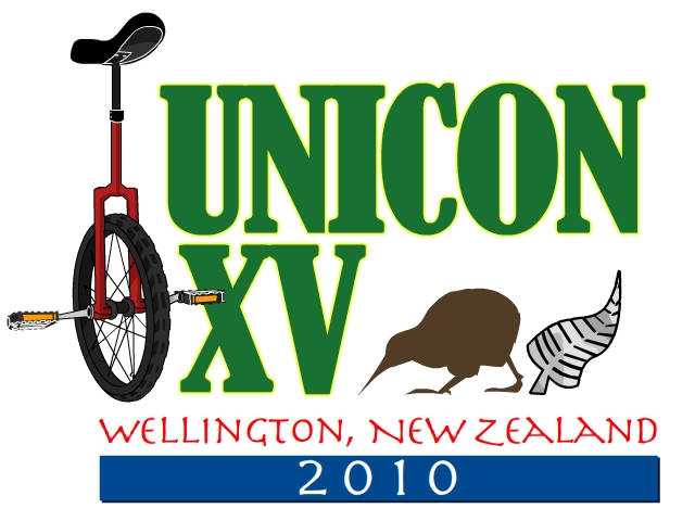
I had another go at it with a slightly different style. One Just black and white for low res/ cheaper reproduction, and one color possibility.
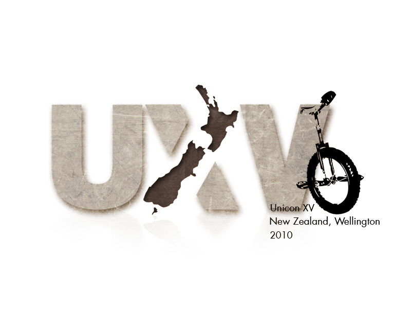
Heres my submission
Here it is! Please comment / critisise (constructively of course)

Keep the designs coming everyone. It’s looking really good!
One thing which I should have emphasised is what information we’re after. I realised that some of you seem to be highlighting all the least important info (in bigger lettering). Also, quite a few logo designs with the wrong dates on them.
The information (in order of importance):
UNICON XV
The 15th Unicycle World Championships and Convention
Wellington, New Zealand
28 December 2009 to 7 January 2010
Personally, I would make UNICON XV in big bold lettering, and all the other stuff underneath can be in smaller type. You don’t need to put the complete dates in there. 2009/2010 will do fine. Or the first two lines (UNICON XV: The 15th Unicycle World Championships and Convention) can all be incorporated in one line. You don’t need to put in a Silver Fern AND a Kiwi. One of the two will do, or a map of the country as some of you have done.
Don’t worry if you’ve submitted already. All the logos will be judged on their merits, but you may be asked to modify some of the information (especially if you put down 2010 as the date of UNICON XV.
Cheers,
Ken Looi
UNICON XV Organising Committee
I love the unicycle Kiwi! Check your PM’s.
I’ll second that!!
I also like when the country shape is incorporated into it, like in the X for XV!!
Nice J. Although I’m not a fan of k1 its good to see you used a diffrent uni then the bland KH.
I like it. Simply but styley. Looks professional. You’ve got skill man.