I like Catboy’s too, except for the pink. It needs to fit with the colors of the website… and it needs a unicycle in it.
I like Blue’s too.
I like Catboy’s too, except for the pink. It needs to fit with the colors of the website… and it needs a unicycle in it.
I like Blue’s too.
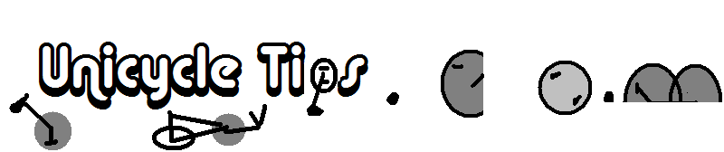
That is a good idea. I wanted to keep the design really simple, but still reflect to purpose of the site. I didn’t want to make the logo look busy, that’s why I only replaced the dots with unicyclists. The idea is a 1,2,3
where the unicyclist has improved their skill as they reach the other end.
As far as the criticism about the image looking bad if resized. It is a vectored graphic and could be printed on a penny, or a bill board and it would look identical.
I’m not critizing. I have said they are nice looking. I’m giving my two cents to help make them even better.
So wheres yours then?
Right there. Not as good as others.
I agree keeping it simple is always good. I really like this one too. Would you be able to do it with a transparent background?
although I have small unicycles in my image why is it necessary to incorporate a unicyle into the logo.
A great example. Nothing even remotely resembling a unicyle. (in the text)
whistles backwards through teeth
Ooh guvnor,that’ll be about 45 instead of 30 seconds on photoshop.
(gets pencil from behind ear and licks tip)
I’ll have to convert pounds to grammes for this… tsk.
Yes, no problem. Just wait until i have a quiet 5 minutes in work tomorrow.
If Catboy’s pizzaz combined with the mount/ride/unispin idea you’ve put forth, there’s the perfect logo right there.
I will attempt to marry the two ideas…catboy let me know if that is cool.
It’s not. There’s no need for one at all. People just seem to expect it. I only stuck one in there (A) because I thought that’s what the brief wanted and (B) because it was bleedin’ easy.
Just look at the top of Unicyclist.com for a nice piece of design. Yes, there is the simplistic unicyclist on the left, but apart from that, nothing fancy. Yet it crowns the top of the page wonderfully.
Too many designers these days tend to over-egg the cake.
“Throw in some spangly graphics and motion blurs and we’re set!”
Nah.
No need. Less is more.
Is anyone keeping tabs on the bill?
I make it $600 so far. ![]()
Here’s a mock up of what the page would look like. I think it fits rather well.
Here is the other mock up
I’d say the first one looks better
I concur. 
The second one is nice, but seems like it is too much of an old time look on it.
The first one is too thin and spindly… it needs to be bold.
what’s the status here?
Hey cmsustud the second one you made doesnt have a transparent background like the first does it? Would you be able to give it one?