np, its what i do.
Okay,Greg,How about a t-shirt with unicycles all over the front ,Munis,trials,all differnt shapes ,sizes,styles and colors with
The words on top “Life is full of important decsions”.
and on the back Uni is life" or somthing.
I’m on it.
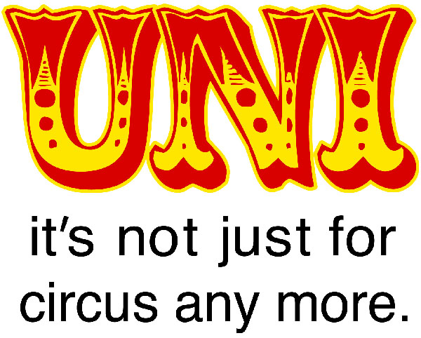
There was another thread I remember about various t-shirt designs, but I couldn’t find the specific one I’m thinking of. Anyway, hope I’m not stealing an idea from anybody, but I’ve been using the following comeback with friends who make circus jokes: Uni: it’s not just for circus anymore.
Anybody like that idea for a t-shirt?
Hey,thats a good one.Or how about just UNI:Its not about the circus.I dont know.
I just noticed How on my last post There are only one Quotation mark.hehe.
Weres critch when you need him?
digigal1, if you like, I can put that design together and post it on cafepress.
G
I lick that idea for a t shirt digigal.
I have a idea for a uni tshirt.Greg a monkey on a unicycle that says its not just for humans anymore.
That’s one with a large target market.
How’s this:
looks like you using chiperfield.ttf…
Some great ideas so far in this thread, and Greg’s right on to them, so I feel a bit picky saying that the font for “uni” looks a little too much like, well, a circus font.
How about it looking a bit more “extreme sports”?
I really like forestunifreak’s bunch of unis idea too.
Keep up the good work, folks!
Dijigal- you’d better put in your opinions. This is your idea and it’s running amok without your input.
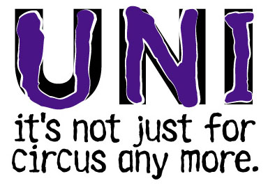
Greg you’re great. I think the circus font is good because its funny in an ironic way. Also I think it should be"… the circus." But then again it isn’t my design and my opinion doesn’t matter that much.
David
David, your opinion’s as valid as anybody’s, I suppose- since we’re trying to cater to what the unicycle crowd wants. You do ride, right? Alrighty, then.
Yeah, the circus font was expressly ironic. The whole point, really. And since the gagline is a parody of the old ‘Milk- it’s not just for breakfast any more’, I left of the ‘the’- Or, rather, digigal did, and I agreed with her.
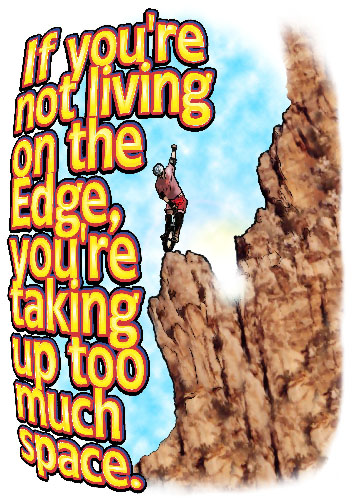
I kinda like the more extreme angle, though. I’ve never been one to wear primary colored irony on my own shirts… Though ‘the edge’ tshirt is pretty primary, isn’t it…
thats pretty good greg.
I think I like the circus font better.I dont know.I like them both.I also think its better without the “the”.
How about one with some kinda “extreme picture”(I dont know what yet…mabye MUni?)on it with the words " MUni:Its what you do".
Whoops. that last post was me. Jarcycle’s my little brother and I forgot to log out.
anyway,what do you think?
…
handelcycle2.bmp (297 KB)
yo forrestunifreak is my bro.