I know i am not involved in the race in any way but those look awesome!
If there is a Canadian and American version maybe have the Canadian version white and red and the American one red and white on the day side and blue and white on the night side. i think that would work really well.
Just want to say again those patterns look awesome and the half and half split is genius.
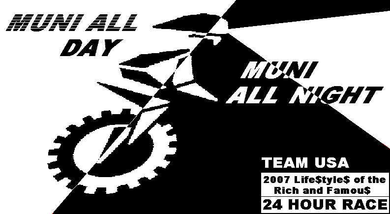
Wow! Pretty cool work, Steve. While the municyclist looks great I think it’s too difficult to make out. Because I’m a municyclists I was able to figure out that it was a person wearing a helmet riding a unicycle but I’m afraid most non-unicyclists will point at the shirt and ask “what’s that a picture of?”
In spite of this I’m not too particular about the shirt design so if the others like it then I’d say go with it.
I saw this semi-custom jersey while surfing the web last night. Can screen any graphic. www.verge.com
Steve,
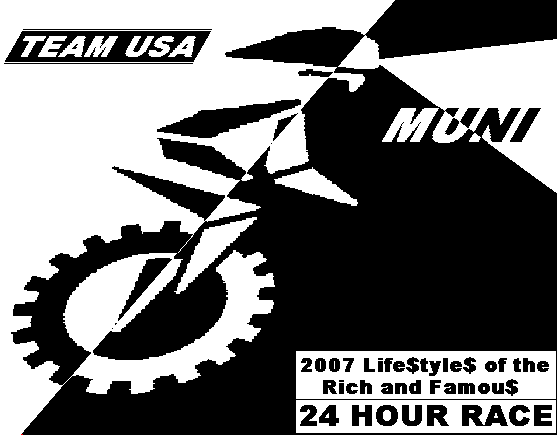
I like #2 the best, although I think the race details aren’t all needed, I’d just put “24hr Race, Team USA”
See you at the race Sunday, I wonder if there will be snow!
-Roland
I’m not at all involved with the race however I like the second design the best. I might try to lose the $ signs though, they make it look a bit juvenile. Neat design overall though.
Sorry for the threadjack, but couldn’t find info in these forums anywhere else. What’s the deal with dryfit shirts? It sounds good to me, as I sweat like crazy when I ride. Do they really absorb a lot of sweat? Why are they so good? On the net I found info about Nike’s Dri Fit shirts; is this what you’re referring to?


