Icons for unicycling disciplines

I think they’re a great start but they are very detailed. For what were they used, and how small?

The basket is clearly a very intentional decision for the basketball one - I’m kind of surprised it was decided to be necessary, but it’s hard to see that outside of a unicyclist’s mindset who knows the sport exists (although that raises another question - is that important?)

I think the Paralympics may be more useful for a design reference as all sets include people in wheelchairs doing various things:

1 Like

They’ve been used for French events and Unicon20. I don’t really know about the size they were printed, though.
If you want to tinker with them, there’s a Photoshop file in the folder that you can probably reuse to simplify the designs.

1 Like

So … totally unplanned … I’m trying to learn how to use inkscape. The first try for urban and trials looks like this:

3 Likes

These are cool! Inkscape is cool, too (and I‘m wondering how you managed to make the tread, but that‘s way off-topic, even for my standards).

Is that the icon for unicycling / Scottish highland dancing?

1 Like

Not enough kilt

1 Like

Those are awesome. If it was up for a vote I would be all in for these.

1 Like

Says who? UPDs are a true art form, mine have entertained countless onlookers.

True, but if UPDs were a discipline they had to be done on purpose …you see the problem, don’t you?
They would end up being PEUPDs (purposefully executed unplanned dismounts), which sadly is just another acronym for PDs, planned dismounts.

2 Likes

UPD should’t be a specific event. It can be recorded during the other events and be awarded in the end, and even post mortem.

5 Likes

Currently trying to make a set of these for a custom T-shirt (1: mount, 2: ride, 3: different ways to end the ride).

What can I say? …first time I wish I could ride an UW! The uni (with a rider) really doesn’t lend itself for pioctograms / icons.

Sounds like you’re going to make a T-shirt to me

1 Like

Could I just get a short feedback, if I’m going into the right direction?

16 Likes

These are very good

If you are a unicyclist, you will know exactly what each of those icons means.

2 questions:

  1. Why white drawings on black backgrounds? The reverse seems more logical to me.
  2. Why not a V-frame for the road unicycle?

Anyway, they are great! Good job!

and the muni.

Honestly, I think the icons are great, even with classic frames.

2 Likes

I think these look great!

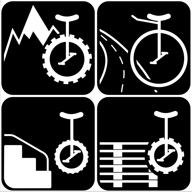
White on black is perfect. Especially with the white stairs and snow covered peak. It highlights the unis and props, making things appear more aggressive maybe.

No V frames. Keep it clean and simple.

1 Like

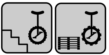
Why do you have 2 for trials?
Maybe for freestyle you can show a ballerina and a small wheel uni without the tire profile. That is how I envision freestyle anyways.

This can be changed at any time. Once the icon set is ready for use, everybody can set the colors as needed. For the usecase I need it for, the black areas will end up being white and the white areas will be transparent / background color.

1 Like