Got mine in the mail today! I was planning on going riding tomorrow, but maybe I’ll just read all day… ok I’ll do both! Really glad I got this in hardcopy.
UDC UK still have them, shipping to the US is £7.50 (GBP) so total would be £23.45 (GBP). Which is about $38.52 (USD).
http://www.unicycle.uk.com/books-videos-and-dvds/unicycle-books/bookmuni-trials.html
Instructions for ordering from outside Europe:
http://www.unicycle.uk.com/faq/buyingfromudc.html#58
![]()
Thanks to this thread I’ve now spent £17 that was meant for food shopping, so it better be as good as you all say
I’m reading my book right now at work! I’ve only made it half-way through the trials section. I don’t really do trials but all of this information is really good for muni. More things to add to my list of stuff to improve.
List so-far: Stillstands, switch hops, switch handle, one-foot, figure eights… I’m sure I’m forgetting some.
Thanks for pointing that out!
Because of the smaller market, it’s tough to do a special print run for just North America, while Europe still has copies.
Thanks for the kind words and it’s an honour to be compared to Paul’s book. I’ve telemarked for as long as I’ve ridden a unicycle and there are a lot of parallels between the sports. In this case, the inspiration for the book came from John Long’s How To Rock Climb, and John provided some great mentorship (plus the forward) during the writing.
Re layout: a huge amount of effort (and around $9000 of book designer expense) went into the print book design, to make sure that the appropriate photos showing techniques discussed in the text were on the same page. It’s hard to do and it took a long time. Hence why I wanted the book to be printed on good quality paper after all that work. There were 1500 books printed in the first run. The comment on illustrations is well taken. It was just too much to do that plus the photos, so I focused on finding good photos tailored to the techniques described in the text.
In the e-book, it’s tough to duplicate the print book design because the text flows from one page to another, depending on the selected size of print and size of the device used to read the book. It’s also not possible to do some things you can do in print, such as a layout extending across two pages. There is such a thing as a fixed-format epub, but it’s an expensive book design and doesn’t work on all devices.
Kris
still in stock NA at compulsion cycles, that’s where I got mine. quick delivery!
http://www.compulsioncycles.com/KH-EssentialGuide?search=the%20essential
Kris,
I should take a look at how the ebook reads on other devices. I have read hundreds of ebooks, and rarely run into formatting problems like the ones I see in this book. The problems aren’t pervasive, but a little off putting when they do show up. It sounds like some of the formatting that I’m seeing could be due to the relatively recent development of ebooks. I would guess that auto-formatting will only get better in time. And, to be honest, not that much time.
The content is excellent, and the writing is clear with good voice and flow. I hope that just reading it will make me a better rider (of course I know that’s wishful thinking).
I am thankful for the book, and I would recommend it to anyone without hesitation (even with the occasional layout problems).
Anyone know if i can find the picture of max schulze on pages 112 and 113 online? I would love to have it as my background.
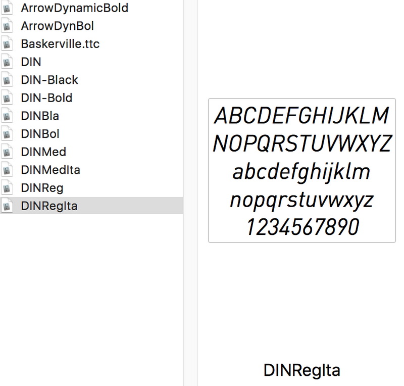
What font?
What font is used in the book? its really nice! ![]()
I bought the book and thought it was quality. Nice paper great pictures and lots of good info. The only complaint I have is that there were a couple of places where the sections didn’t match up in my edition. Page 104 text sentence ends page 105 + 106 are pictures then page 107 starts mid sentence and it’s about hops. Page 104 was about the rating system.
I just bought my book about a week ago, after reading this thread. The photos are the National Geographic of unicycling. Great job Kris.
The rating system is separate from the hopping. The Landing Seat-Between-Legs To Flat Ground is discussed on page 103 and continues on page 107.
As far as a layout of a book does that make sense? Why would you have a section continue after another section? Other than that I love the book. That is an editors issue not the authors.
Good catch on the layout, the sentence is complete but it would have been better if it had ended on the first page. This book was a massive effort to edit, layout-wise, because of the need to place so many photos so that they made sense in relation to the text, and keep the text flowing nicely. And every edit potentially has a subsequent effect on all the pages after that. Hence why I’m really happy when anyone chooses the print version over the e-book.
Attached is a screen capture of the fonts used FYI.