Not enough contrast for me, I edited the CSS and changed --primary and --header_primary to #fff and I really like it like that.
1 Like
It’s great as is for me. I really prefer dark. Thanks!
2 Likes
With the new black tyre the unicycle again doesn’t look very nice in dark mode as most of the wheel is pretty much invisible. (Sorry for complaining again - it’s just that I like the unicycle spinner so much…  )
)
1 Like
I used the wrong file. It’s fixed 
2 Likes
Hehe, I like the Helloween styling.
1 Like
I still think the font colour should be white.
Everybody is going dark then? I bet the Halloween Theme is scarier in the dark.
1 Like
I’m still not really happy with the dark theme, the blue buttons and text hurt my eyes. I’m sure there are improvements to be done, but also each user has their preference…
1 Like
Yup, in my job I grew to be the UI guy, developing the UI for the Excel Add-Ins and latest website. Both for functionality and looks every user in the company has their own ideas for how things should look. (We have about 1000-1500 users) So when there is functionality where we think it will benefit all, we will use that and otherwise dictate the looks ourselves. Then after a month or so the users are used to how things look and are less likely to complain.
Personally I don’t mind the brighter blue. You will always need good contrast for readability. With a dark background, it is harder to find the right colours.
1 Like
The dark theme is working wonders !
The only readability I have noticed is the dark blue of the buttons/notification badges/urls that is not contrasting well on black-ish(or at least is not sufficiently enough of one of them). No idea if it is as simple as making the text bold to have a better color presence or if it is the hue that is not working well…
Anyway, a pleasure to use and the text shade proves that contrast without eye burns is possible 
I just modified the blue for a lighter tint.
You need to completely reload the page to see the color change.
You should prolly keep it that colour blue for readability, but I liked the previous.
Will you also change it on the scrollbar? That is still the old blue and maybe change the photo of the Flamingo uni, which should be a tad lighter too.
I will never go back to light mode.
Done!
Do you mean the emoji ![]() ?
?
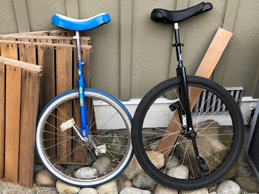
I wasn’t serious. I was looking at this picture
1 Like
Nice new shade. The reply button demonstrates the improvement best and the URLs require less squinting !
You are unstoppable ![]()
1 Like
How easy would it be to add an option to sync light/dark mode with the OS?
1 Like
There’s a site setting for this, but it seems it only allow to select a light or dark color palette, which wouldn’t work here, since the light and dark themes use not only a color palette, but also other features and files. I’ll see what I can do.
1 Like
Ah, no worries. It would be nice to have but it’s not essential
1 Like