Here’s what I’ve come up with so far. Over the Xmas break, when I’m not so busy with avoiding school to unicycle, I’m gonna have the words spinning like the wheel would, and have the site layout better. It’s a work in progress…
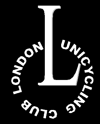
But what do you think about the logo? Not relly too much you can do with unicycles (as far as the crumpled up paper all over my floor tells me)
Personally, I like the solid colors and the simplicity of your design. The only change I’d make is not having the frame in the shape of an “L”. Since the name is spelled out as the wheel, the frame being an 'L" doesn’t add anything in terms of meaning and is, I think, less visually appealing that a straight and therefore, symmetrical frame would be.
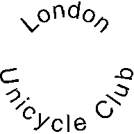
I love the idea! Personally I would change the font of the L. Perhaps make the top look more like a saddle and the bottom without the tail on the back. Overall it’s a great idea.
I think that your website should clearly state that you all are in Canada, and perhaps where therein, rather than England. I personally keep making that mistake until I see that you are going to ride with the Toronto club.
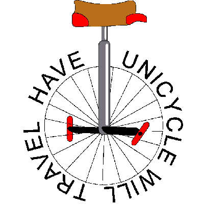
Spinning words would be great. My only comment is that the word club in the position that it’s in seems to be hard to read. You’re not going to be able to spin the words on a tee-shirt. I’m not sure how to incorporate the “L” into this design but the words would be easier to read on a designed tee-shirt. Perhaps spokes in the center of the wheel and the “L” above the wheel indicating some sort of frame.
Humm… could use some Billy Idol referance, though…
(a curious side note that you may appreciate: William picked the name ‘Idol’ as a homonym to the title bestoed by a grade school teacher, ‘Billy Idle’. Takes on new meening, yes?)
Looks great. I like it.
If we get a minimum order of 12 we can get custom jerseys from Sugoi. I don’t know how the words will spin on the jerseys though:)