my only sugestion about the t-shirt is a nice colour please, thought the design was good on BUC10 but the colour was a bit…
browny for my liking, a nice red or blue?
aaron
Would be nice at Buc everybody with personilsed t-shirts so i dont have to remember so many names!!
Trev
So… Anyone come up with a good design?
We need YOUR ideas! ![]()
(we will give you credit for it!)
Joe,
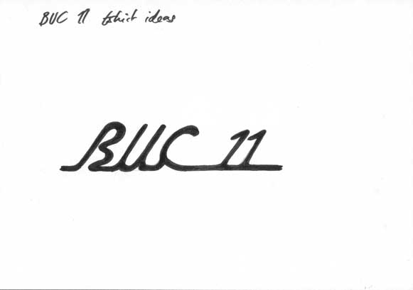
ahh the joys of paint… here is a loose idea, just to get the ball rolling.
i was bored and came up with this quickly, if this was to be taken seriously the the ‘11’ could do with being in italics aswell, and a rider gliding and slightly leant forward with the italics. ho hum im gonna get what sleep i can now, its 4am, and ive got school 2mo!
Tom, that is really great!
Is that a pic of you wheel walking?
Defiantly one to consider!
Any more ideas anyone?
Joe,
i wish! im still learning
ill post some more ideas up later maybe, go to eat now
Thats good! Although I personally would prefer more of a trials/Muni/extreme side to it just an idea?
aaron
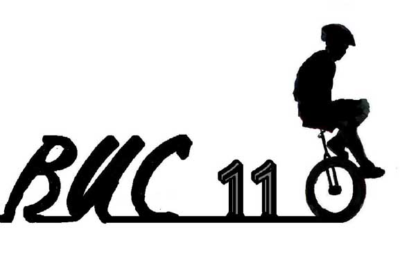
How about having big letters for BUC 11 with a cartoon/silhoutte type image of a unicycle on each letter, so that you can have 1 or 2 for the various styles? My art isn’t up to much but if I get some spare time I’ll have a go.
John
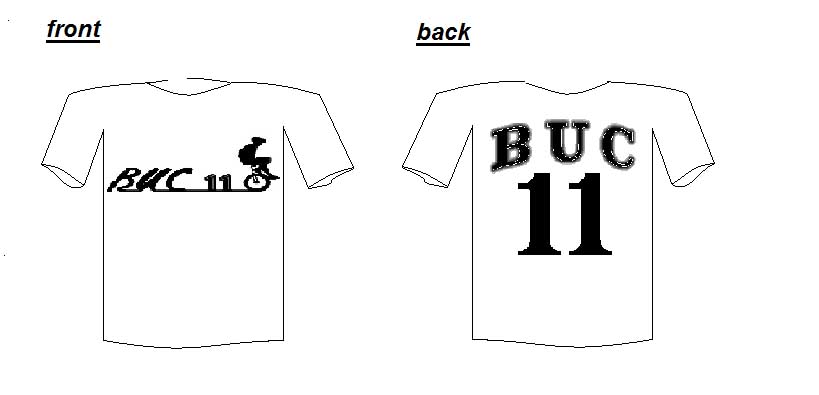
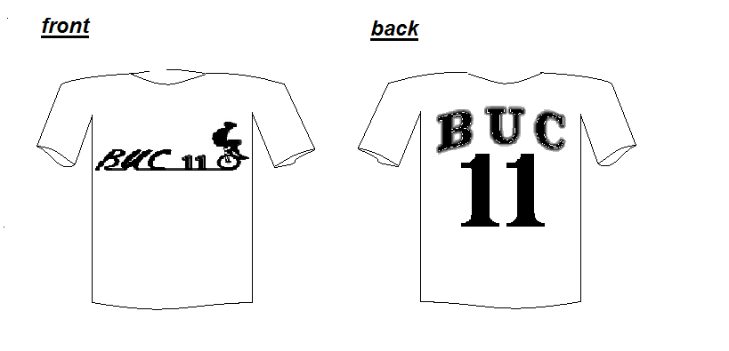
heres a revised segment of my design, drawn free hand as opposed to god old paint.
heres more of my idea, on the back it could be a hockey shirt like deisgn, which could incorporate johns idea, and that would also mean you can have silhouttes of images favoured by pluto, as i said just a thought
come on other people must have better ideas, or do i have too much time on my hands?
buc_tshirt_template.bmp (949 KB)
Wheres everyone elses input!
aaron
Personally, I like the front of Tom’s and I REALLY like the back of Aaron’s. That’s a great idea!
come on people, post some more designs, if not at least describe your ideas and give some pics you want to include, and i will try and put pen to paper for you.
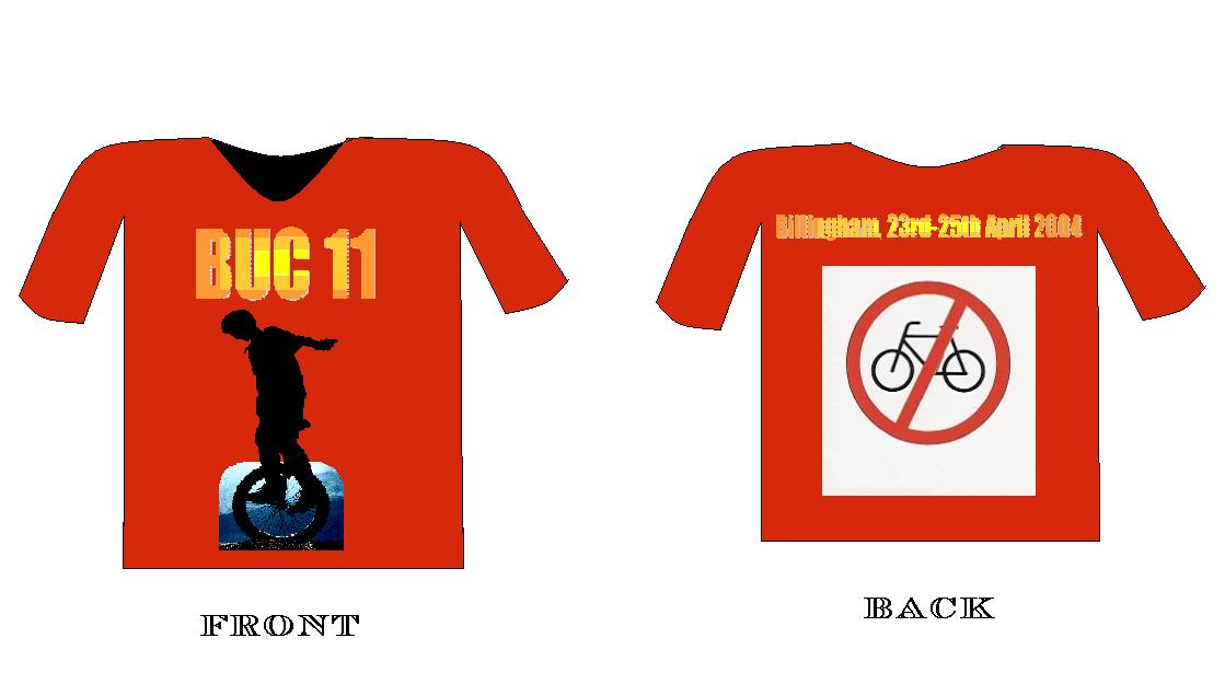
heres the latest revision of my design…
All these designs are really great, however a mini philosophy with regards to t-shirts could be:
most things look more extreme when upside down 
just, erm consider it…
tim
I don’t catch your drift? could someone care to explain what that last post was about?
oh yea and pluto i love the back of your shirt idea, thats pretty cool
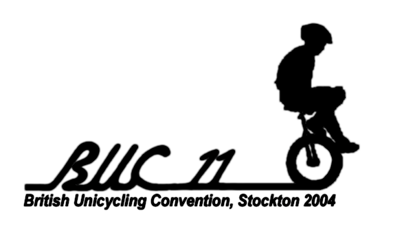
i thought that the image needed to be cleaned a little bit. otherwise i think it’s an awsome concept.
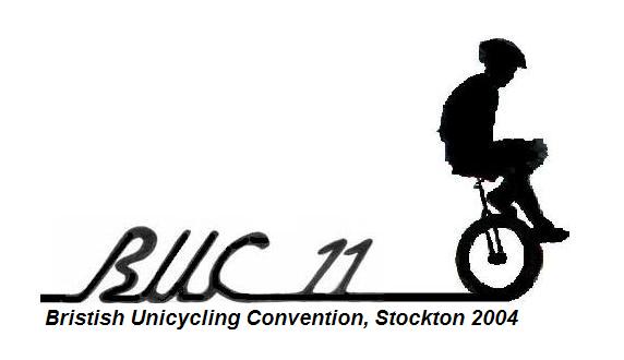
EDIT: did anyone else notice that “British” was spelled wrong in the origional image?
haha, thanks for changing that, worrying that i study english at A/S level isn’s it:(
thanks for cleaning it up it looks much better now than my original.
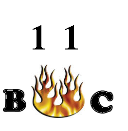
mevs sent me this design also, i like it, it would be good for the back of the t, maybe’s?
buc11.bmp (209 KB)
I think we need some input from the B.U.C organisers now? Roger? anyone?
aaron